
How Devils Backbone Got the Blue Ridge Onto a Six Pack
TWO YEARS AFTER ITS ACQUISITION BY ANHEUSER-BUSCH, THE VIRGINIA CRAFT BREW GETS MORE POLISHED PACKAGING
ADWEEK | September 27, 2018
BY ROBERT KLARA
During the golden age of travel—before the internet, even before television—Americans who saved up their dollars would wander into atravel office and be dazzled by the color lithographs on the wall: travel posters of romantic and exotic destinations, rendered in a gauzy, dreamlike state so alluring you wanted to step inside. For shipping lines and railroads hoping to lure customers, the posters were the most effective marketing of their era.
All of that pretty much ended with WWII, but the dreamy aesthetic of the travel poster still possesses its power to draw consumers’ attention—and now, that power is being harnessed by an unlikely company: Anheuser-Busch.
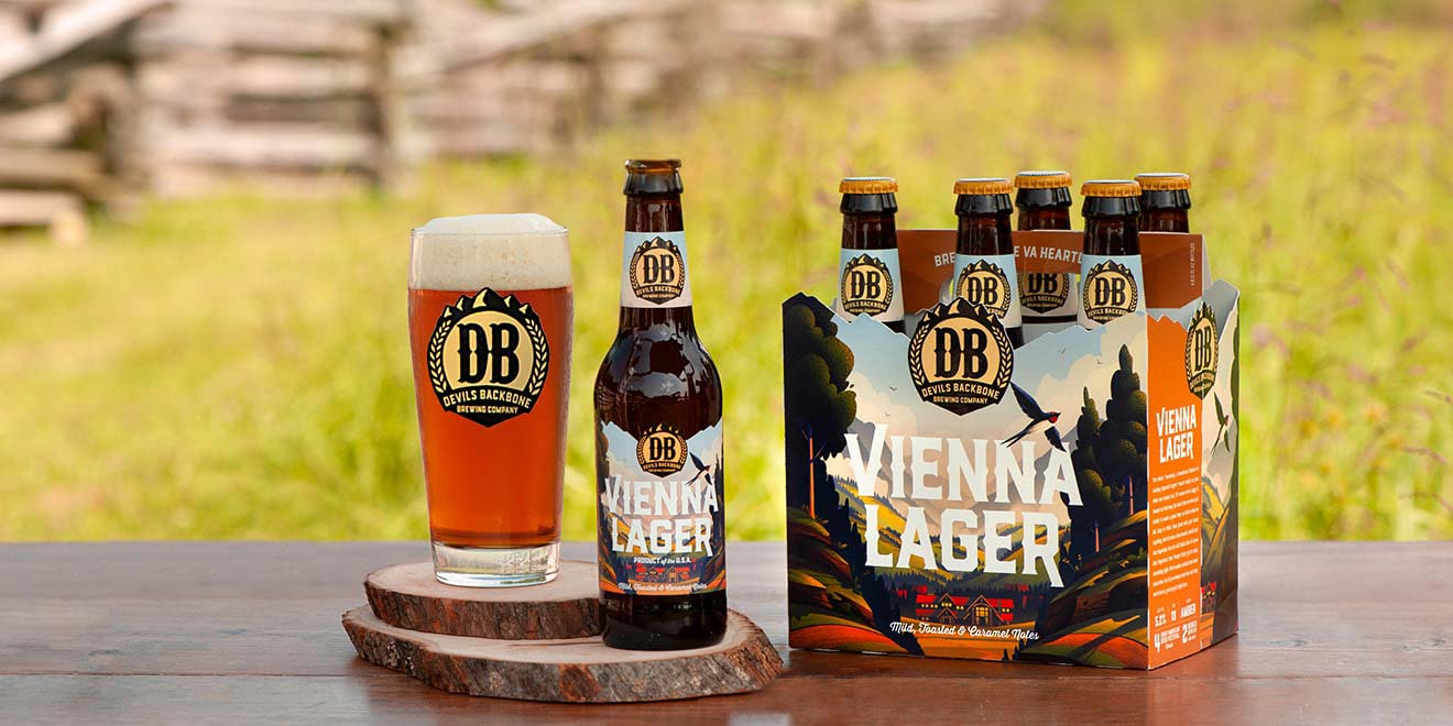
Not Budweiser, though. In 2016, A-B acquired a craft brew called Devils Backbone, which enjoyed a loyal following in Maryland, Virginia and Washington, D.C. Now, two years after that purchase, and 10 years after Devils Backbone first poured from the tanks, the brand has just debuted a new visual identity inspired by travel posters of yore. In this case, the “destination” is Nelson County, a lush and misty tract of 474 square miles in central Virginia crowned by the Blue Ridge Mountains to the northwest. The county isn’t just the home of the brewery, it’s central to the beer’s history and, hence, a fitting theme for the packaging.
“Until about six months ago, you could barely make a cellphone call here, so it very much feels like a destination—that sense of being able to get away from it all, or celebrating slow moments,” said Devils Backbone marketing director Marisa Black. “We wanted to do that on the pack. Not a ton of people know how gorgeous the area is.”
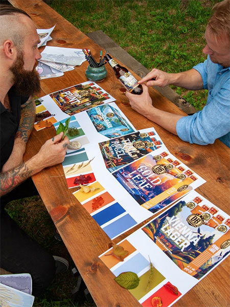
Developed by design shop Okay Yellow with a creative assist from Familiar Creatures, the new packaging features romantic settings that correspond to the multiple varieties the brand sells—an eruption of fall foliage for Gold Leaf Golden Lager, an underwater aquamarine tableau for Striped Bass Pale Ale, and so on. The bottle caps match the predominating colors of the labels and bottle carriers. Each scene evokes the Blue Ridge section of the Appalachian Mountains chain, which is so central to the brand’s identity.
Read the full article on Adweek.