
Beer & Branding: Devils Backbone Rebrand
THE HOP REVIEW | December 4, 2018
BY JACK MULDOWNEY
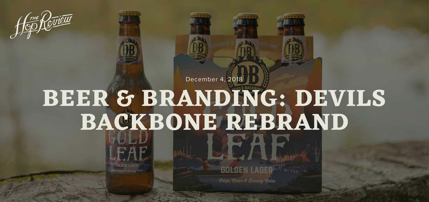
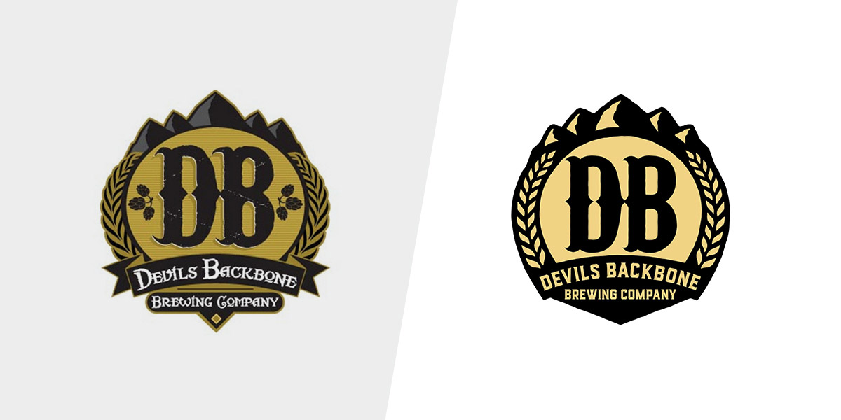
Timed with their 10th anniversary in 2018, Devils Backbone Brewing Co. is modernizing its brand with all new packaging, as well as a refreshed logo, for the first time since brewing its first beer 10 years ago. As the brewery states it, the new packaging design is meant to “exemplify its friendly, approachable, and outdoor personality and ‘Slow by Nature’ messaging.” The look and feel of the packaging refresh is based on a “modern travel poster” with illustrations featuring Virginia outdoor and landscape scenes. To achieve this, Devils Backbone built an impressive creative team (it helps to have A-B money to play with!), enlisting the expertise of Charlottesville-based design agency Okay Yellow in partnership with Familiar Creatures and two different, renowned illustrators: Award-winning Colorado-based illustrator, Brian Miller and Canadian illustrator of over 25 years, David Moore. Whew, did ya catch all that?
The illustrations for each beer are really the homerun of this rebrand. Each bottle label and 6-pack features a custom die cut reflecting the landscape of the Appalachian Mountains, paired with stylized beer names unique to each beer. Those elements, set against the beautiful travel-poster-inspired illustrations create a foundation for the Devils Backbone portfolio, for each beer going forward.
Looking ahead, Devils Backbone’s will continue to roll out new pieces of their new marketing campaign launching in 2019: “Slow by Nature.” This campaign exemplifies how Devils Backbone takes its time making lagers in the Virginia Heartland–a place nestled in the Blue Ridge mountains away from the hustle and bustle of life.
We’ll be patiently awaiting its rollout in ‘19…
![]()
Read the full article on The Hop Review.